Use of Baby Powder Blue in Interior Design
Baby powder blue gives rooms a clear, optimistic lift. Used in lighting, it can make a hallway, bathroom or bedside corner feel lighter without becoming childish. Interior designers often start with furniture, paint or fabric, but the colour of a lamp, sconce, pendant or chandelier can be just as important. Lighting is both an object and an effect: you see the fixture during the day, then you experience the colour again at night through glow, reflection and shadow.
Why Baby Powder Blue Works in Interior Design
Baby Powder Blue brings freshness, air and gentle optimism to a room. The key is to decide whether the colour should be the main event, a supporting accent or a quiet thread that connects other elements. In a lighting-led scheme, baby powder blue does not have to cover a wall to change the mood. A pendant over a dining table, a pair of wall lights beside a bed or a sculptural ceiling light can set the tone with far more precision.
A good colour strategy also depends on finish. Glossy surfaces feel more glamorous and reflective; matte finishes feel architectural; frosted glass makes the colour softer; fabric and fringe introduce movement. This is why lighting is such a useful way to work with baby powder blue: you can control the intensity by choosing the right material and the right bulb temperature.
Start With the Lighting Plan
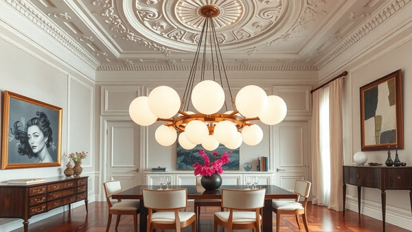
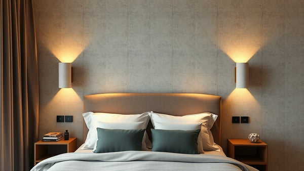
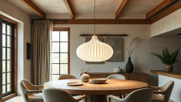
Before adding more accessories, map the room in layers. Ambient light gives the room its general brightness, task light helps you read, cook or work, and accent light creates atmosphere. A baby powder blue fixture can play any of these roles, but it is usually most effective as accent or feature lighting. That might mean a statement pendant in the centre of a room, a wall light that draws the eye along a corridor, or a table lamp that creates a small pool of colour in the evening.
Think about what the fixture will do when it is switched off as well as on. During the day, the colour reads as part of the interior composition. At night, the shape and shade affect the quality of light. Warm white bulbs usually flatter coloured fixtures, while very cool bulbs can make even beautiful colours feel harsh. Dimmable bulbs are ideal because they allow baby powder blue to shift from decorative accent to evening atmosphere.
Product Ideas for a Baby Powder Blue Lighting Scheme
The following Nauradika product pages are useful starting points for this colour story. Some products are available in several finishes or colour variants, so select the baby powder blue option on the product page rather than assuming the hero image shows the exact shade.
- First lighting option — open the product hero page and choose the baby powder blue variant or finish where several options are shown.
- Second lighting option — open the product hero page and choose the baby powder blue variant or finish where several options are shown.
How to Pair Baby Powder Blue With Other Colours
A strong interior rarely depends on one colour alone. For baby powder blue, a reliable palette includes white, cream, pale yellow, oak, chrome, soft grey and rosewood. Use these supporting tones to decide what should recede and what should stand out. If the fixture is sculptural, keep the surrounding wall quiet. If the room is already rich in pattern, choose a simpler lighting shape so the colour feels curated rather than crowded.
Materials matter just as much as colour. Wood will make baby powder blue feel warmer, stone will make it feel more architectural, and glass will make it more luminous. Metal details can either sharpen the look or make it feel more luxurious. The best interiors repeat an accent two or three times in different scales: perhaps a baby powder blue wall light, a cushion with a related tone and a small artwork that picks up the same note.
Designer Tips
- Use baby powder blue glass to bring freshness to white or cream walls.
- Pair the colour with simple Nordic shapes so the effect is crisp, not themed.
- Where a product offers several colours, choose the baby blue or closest pale blue variant after landing on the hero page.
Common Mistakes to Avoid
The most common mistake is using colour only as decoration after the room is finished. Instead, let the lighting fixture influence the palette from the beginning. Another mistake is choosing a coloured light without considering the wall behind it. A beautiful sconce can disappear on a busy wall or look too stark on pure white paint. Test the relationship between fixture, surface and bulb temperature before committing to the full scheme.
Finally, avoid using every object in the same colour. A room feels more expensive when the colour appears with restraint. One or two well-chosen lights can create more impact than a dozen small accessories. With baby powder blue, the goal is not to match everything; it is to create a visual rhythm that feels deliberate.
Final Thought
Baby Powder Blue is most successful when it is treated as part of the lighting architecture of the room. Choose the fixture carefully, select the correct colour variant on the product page, use warm and dimmable bulbs where possible, and let the shade interact with walls, furniture and materials. Done well, baby powder blue becomes more than a colour choice: it becomes the mood of the space.
Nauradika Trade