Brass in Decor: A Timeless Classic or a Tacky Trend?
The enduring debate over brass in interior decor—whether it represents a timeless classic or an overdone trend—gains richer context through several insightful Nauradika articles. In the original essay, “Brass in Decor: A Timeless Classic or A Tacky Trend?”, the discussion centers on how brass’s warm tones can elevate elegance but also risk excess if improperly balanced.
The Historical Allure of Brass
Brass has been a defining material in interior design for centuries, admired for its golden warmth, tactile richness, and old-world charm. From Victorian-era fittings to Bauhaus modernism and the glam of the 1970s, brass has always adapted to the visual language of its time. Its ability to shift from ornamental to minimalist makes it uniquely versatile in home decor.
In the companion piece “Streamline Moderne: Timeless Interior Appeal”, the role of craftsmanship is front and center—highlighting how curved forms and polished metal finishes like brass conveyed movement and luxury in early 20th-century interiors. Streamline Moderne didn’t just popularize brass—it defined how to make it feel elevated, sculptural, and timeless.
Today, brass continues to carry that legacy, but its application requires more nuance. When used thoughtfully—such as a single sconce, a lamp base, or hardware detail—it channels a sense of quiet opulence. When overused or poorly paired, however, it can tip into ostentation. This duality is part of what keeps brass exciting for contemporary designers: it walks a fine line between heritage and trend, and that tension is where the magic happens.
Shades, Finishes & Subtlety
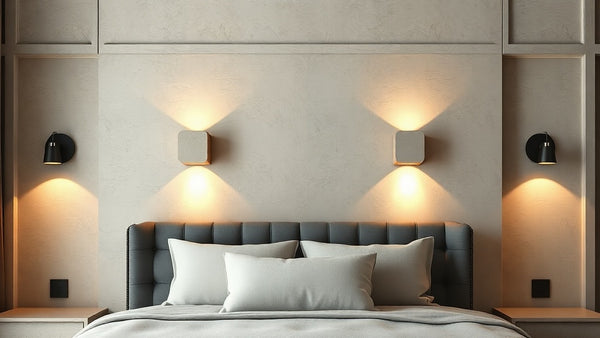
The impact of brass in a room can change drastically depending on its finish. Polished brass can add a bold and reflective highlight to a neutral room, but too much sheen can feel dated or overpowering. On the other hand, brushed or matte brass delivers a softer, more contemporary impression—like a whisper of warmth instead of a shout.
As discussed in “What Are the Origins of Mid‑Century Modern Design?”, post-war Italian designers used brass sparingly and intelligently. Paired with earthy colors, teak wood, and geometric furniture, brass became less about shine and more about subtle sophistication. Its role shifted from decorative excess to functional accent—an intentional pivot that influenced generations of lighting and furniture design.
This philosophy persists today. Designers now prefer aged or unlacquered brass that evolves with time, adding depth and story to interiors. By resisting the urge to over-polish or saturate a space with metallics, homeowners can introduce brass in a way that respects its materiality while aligning with modern aesthetics. A single piece of brass hardware or a sculptural lamp may be all that’s needed to transform a space.
Balancing Brass with Complementary Materials
Brass never lives in isolation—it thrives when surrounded by contrasting textures and complementary tones. The beauty of brass lies in its ability to pair with both natural and industrial materials, which softens its glow and makes it feel grounded. Whether it’s framed by walnut wood, frosted glass, or woven linen, the goal is to let brass highlight rather than dominate.
In “Explore 20th Century Interior Design Trends”, we see how brass played a versatile supporting role throughout the decades. From the bold geometry of Art Deco to the raw minimalism of Brutalism, brass was shaped by the materials around it. Today, pairing it with sustainable elements—like cork, clay, or wool—can reframe it as earthy and organic rather than cold or flashy.
In practical terms, that means choosing a brass pendant light with a ceramic base, or a coffee table with brass legs and a concrete top. It also means understanding scale: small brass touches on drawer pulls, mirror frames, or faucet fittings are often more effective than large, overpowering statements. With the right blend, brass becomes a design bridge—tying natural materials to man-made form in one coherent language.
Color Theory & Contrast
One of the most powerful ways to elevate brass is through color contrast. The richness of brass comes alive when placed next to darker hues—navy, forest green, charcoal, or, most effectively, black. This juxtaposition creates visual tension, drama, and a clear point of focus in a room.
The article “Use of Black in Interior Design” explores how black doesn’t have to feel moody or overpowering—it can actually highlight metallics like brass, making them appear warmer and more radiant. This interplay is especially impactful in kitchens, bathrooms, and entryways where light sources are carefully placed and surfaces are purposefully curated.
Even within lighter color schemes—such as sage green, blush pink, or cream—brass provides warmth that complements rather than clashes. The key is restraint. Rather than flooding a space with gold tones, choose one or two focal points—a brass pendant over a dark dining table, or brass cabinet knobs against matte black cabinetry. These small moments of contrast are where brass truly shines.
Contemporary Design Applications
Reflecting on design evolution, the piece “Brass in Modern Minimalism” (a retitled chapter in the same collection) considers how updated minimalist interiors still embrace brass, now in understated forms—ceramic socket bases, slender metallic trims, or brushed hardware—resulting in soft luxury that’s approachable rather than ostentatious.
Five Related Nauradika Articles for Deeper Insight
- Brass in Decor: A Timeless Classic or A Tacky Trend? – the foundational article exploring brass’s dual appeal.
- Streamline Moderne: Timeless Interior Appeal – illustrates brass in vintage-modern aesthetics.
- What Are the Origins of Mid‑Century Modern Design? – explores the restrained use of brass in post‑war interiors.
- Explore 20th Century Interior Design Trends – contextualizes brass within broader stylistic currents and material pairings.
- Use of Black in Interior Design – discusses color contrast strategies that soften metallic shine.
Ultimately, brass need not be tacky—even a small dose can feel luxurious if integrated mindfully. Its success in decor depends on thoughtful pairing, balanced finishes, and keen awareness of color and context. When paired with complementary materials or muted tones, brass becomes a tool of subtle elegance rather than visual noise, as highlighted in these curated Nauradika articles.
Nauradika Trade